The Psychology of Color: How to Choose the Perfect Palette for Your Space

The Psychology of Color
Choosing the perfect pallete of color is a powerful tool in interior design, influencing not only the aesthetics of a space but also the emotions and behaviors of its occupants. Understanding the psychology of color can guide you in selecting a palette that enhances the ambiance and functionality of your home. This comprehensive guide delves into how different colors affect mood, practical considerations for each room, and design principles to create a harmonious environment.
Understanding Psychology of Color
Each color elicits specific psychological responses:
-
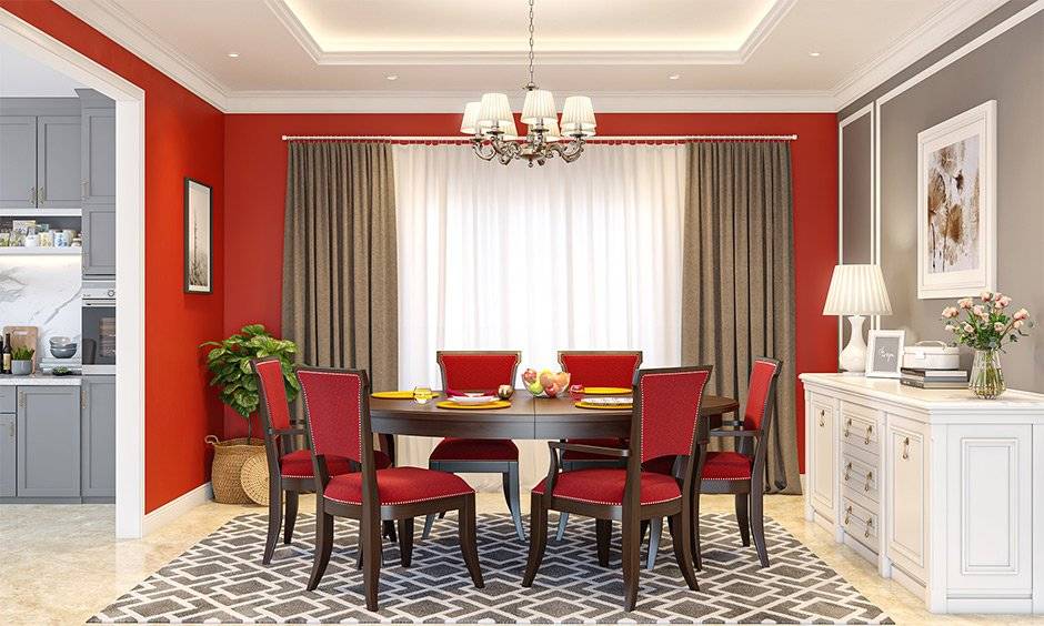
Red: Associated with passion and energy, red can stimulate excitement and appetite. It’s ideal for spaces meant for social interaction, such as dining rooms and living areas.
- Blue: Known for its calming effect, blue promotes tranquility and is often used in bedrooms and bathrooms to create a serene environment
-
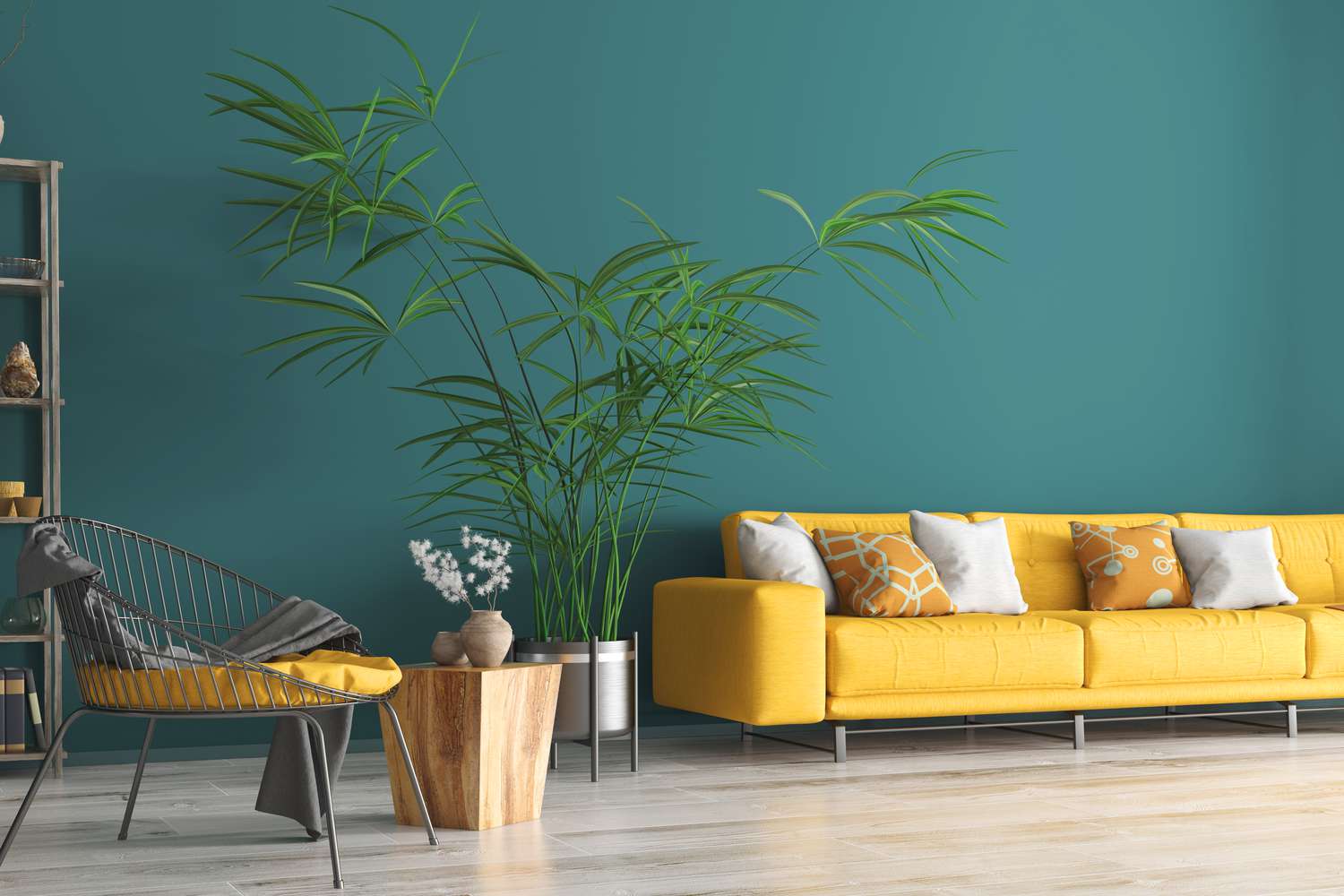
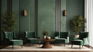
Green: Symbolizing nature and renewal, green offers a restful and balanced atmosphere, suitable for almost any room.
-
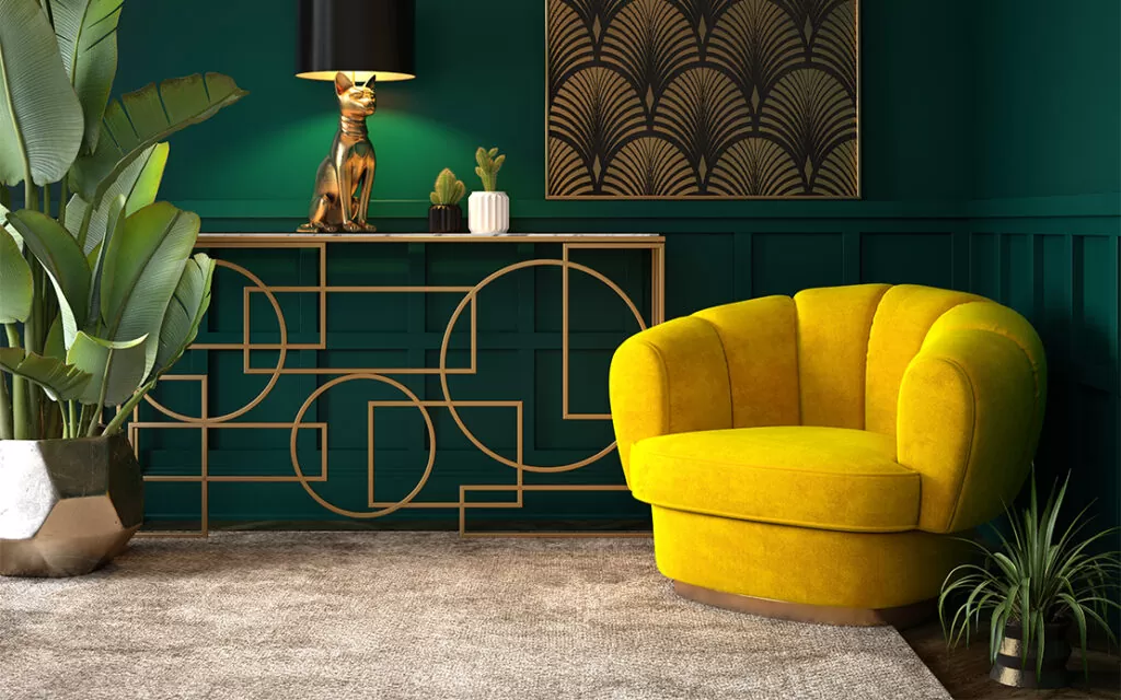
Yellow: Emanating warmth and cheerfulness, yellow can brighten spaces but should be used sparingly, as excessive yellow may lead to feelings of frustration.
-
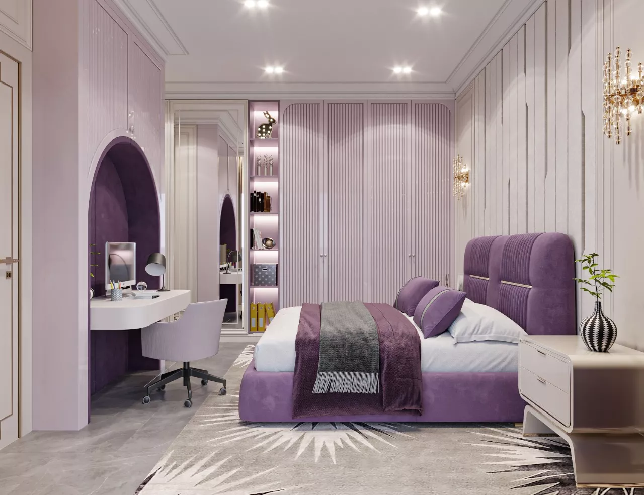
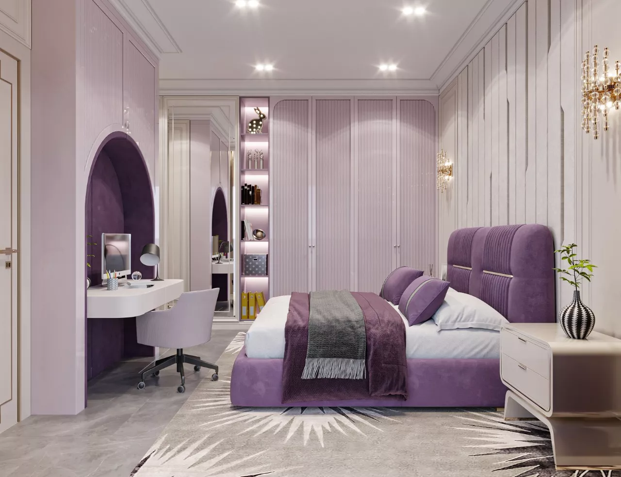
Purple: Often linked to luxury and creativity, deeper shades like eggplant can add sophistication, while lighter hues like lavender evoke calmness.
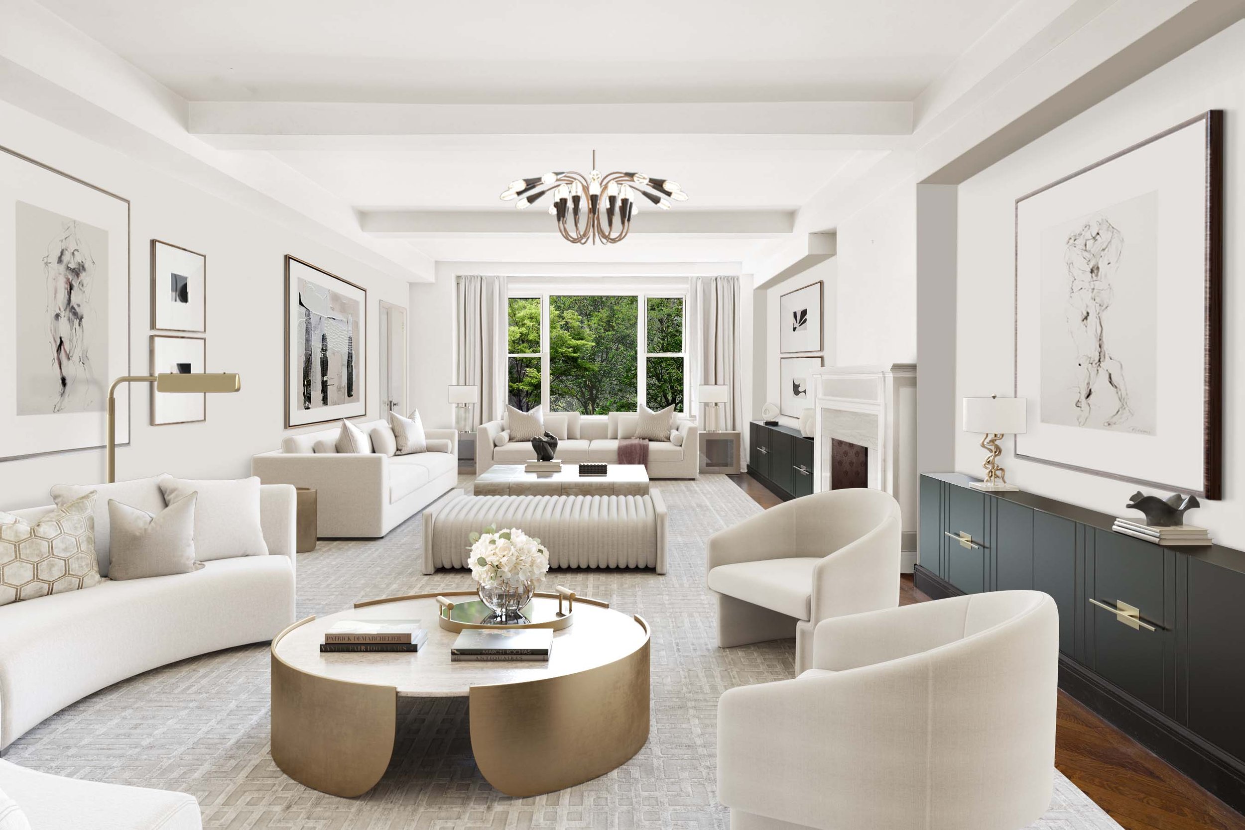
- Neutral Colors (White, Gray, Beige): These colors provide a versatile backdrop and can make spaces feel open and airy. They are excellent for highlightingartwork or furniture.
Practical Considerations for Each Room
Beyond the broad strokes of color psychology, selecting the right palette for specific rooms involves understanding the room’s purpose and the desired mood:
-
Living Room: As a social hub, warm and inviting colors like earthy tones (warm browns, soft greens) encourage relaxation and conversation.
-
Kitchen: Warm colors such as reds and yellows can stimulate appetite and energy, making them suitable for kitchens. However, opting for muted shades can prevent overstimulation.
-
Bedroom: Cool colors like blues and greens promote relaxation and are ideal for restful environments. Soft, muted tones can enhance the calming effect.
-
Bathroom: Light blues, greens, or neutral tones create a clean and refreshing atmosphere, enhancing the sense of cleanliness and tranquility.
-
Home Office: Colors that boost concentration and creativity, such as muted blues or greens, are beneficial. Incorporating touches of yellow can also stimulate innovation.
Design Principles for a Harmonious Palette
To create a balanced and aesthetically pleasing color scheme, consider the following design principles:
-
The 60-30-10 Rule: This classic interior design rule suggests dividing a color scheme into 60% dominant color, 30% secondary color, and 10% accent color. This ratio ensures balance and allows the eyes to move comfortably from one focal point to another.
-
Color Harmony: Utilize the color wheel to select harmonious color combinations:
-
Complementary Colors: Colors opposite each other on the wheel (e.g., blue and orange) create a vibrant look when paired.
-
Analogous Colors: Colors next to each other on the wheel (e.g., blue, blue-green, and green) provide a serene and comfortable design.
-
Monochromatic Scheme: Using varying shades of a single color can create a cohesive and soothing appearance.
-
Testing Colors Before Commitment
Before finalizing your color choices, it’s essential to test them in your space:
-
Sample Paints: Apply small sections of paint samples on your walls to observe how they look at different times of the day and under various lighting conditions.
-
Consider Lighting: Natural and artificial lighting can significantly alter the perception of color. Ensure your chosen palette maintains its desired effect under all lighting scenarios.
-
Assess the Flow: Ensure that the color transitions between rooms are harmonious, especially in open floor plans, to maintain a cohesive look throughout your home.
Incorporating Trends Mindfully
While it’s tempting to follow current color trends, it’s crucial to choose hues that you genuinely enjoy and that suit your space:
-
Timeless vs. Trendy: Incorporate trendy colors through easily changeable elements like throw pillows, artwork, or accent walls, while keeping larger, more permanent fixtures in timeless shades.
-
Personal Preference: Your home should reflect your personality and preferences. Choose colors that make you feel comfortable and happy, regardless of current trends.
Final Thoughts
Selecting the right color palette is a nuanced process that combines an understanding of color psychology, practical room considerations, and design principles. By thoughtfully choosing colors that align with the function of each space and your personal preferences, you can create a harmonious and inviting environment that enhances your well-being and reflects your unique style.
A Palette That Tells a Story
The Nolita Harbour color palette isn’t just about aesthetics—it tells a story of elegance, sophistication, and intentional design. Every shade is chosen to create spaces that feel both luxurious and livable, blending classic design principles with modern sensibilities. Whether you’re designing a boutique hotel, a chic urban loft, or a serene home retreat, Nolita Harbour’s palette serves as the perfect foundation for a space that exudes style and harmony.