Color Without Chaos: Using Warm Neutrals in Sophisticated Interiors
In the world of interior design, color is one of the most powerful tools we have to shape mood, space, and atmosphere. While vibrant palettes have their place, warm neutrals have steadily risen as the go-to choice for designers seeking sophistication, calm, and timeless elegance. Tones like sand, clay, taupe, beige, cream, and soft brown offer understated beauty that feels both grounded and luxurious. When used correctly, they create a cohesive look that soothes the senses without sacrificing depth or interest.
Warm neutrals are anything but boring. They bring subtle richness to interiors, especially when paired with textural elements and considered silhouettes. The beauty of these hues lies in their ability to anchor a space without overwhelming it, letting materials and forms shine while providing a warm, welcoming canvas.
Why Designers Love Warm Neutrals
There is a quiet power in restraint, and warm neutrals exemplify this principle. Interior designers often turn to these tones for their flexibility and universality. They pair beautifully with natural materials like wood, stone, and linen, and can be adapted to suit styles from Scandinavian minimalism to Mediterranean warmth.
Psychologically, warm neutrals evoke feelings of calm, security, and warmth—elements we increasingly crave in our fast-paced, overstimulated world. These tones also offer timelessness, ensuring that interiors don’t feel dated after a few seasons. Rather than dominating a room, they highlight craftsmanship, natural light, and quality materials.
Building a Sophisticated Neutral Palette
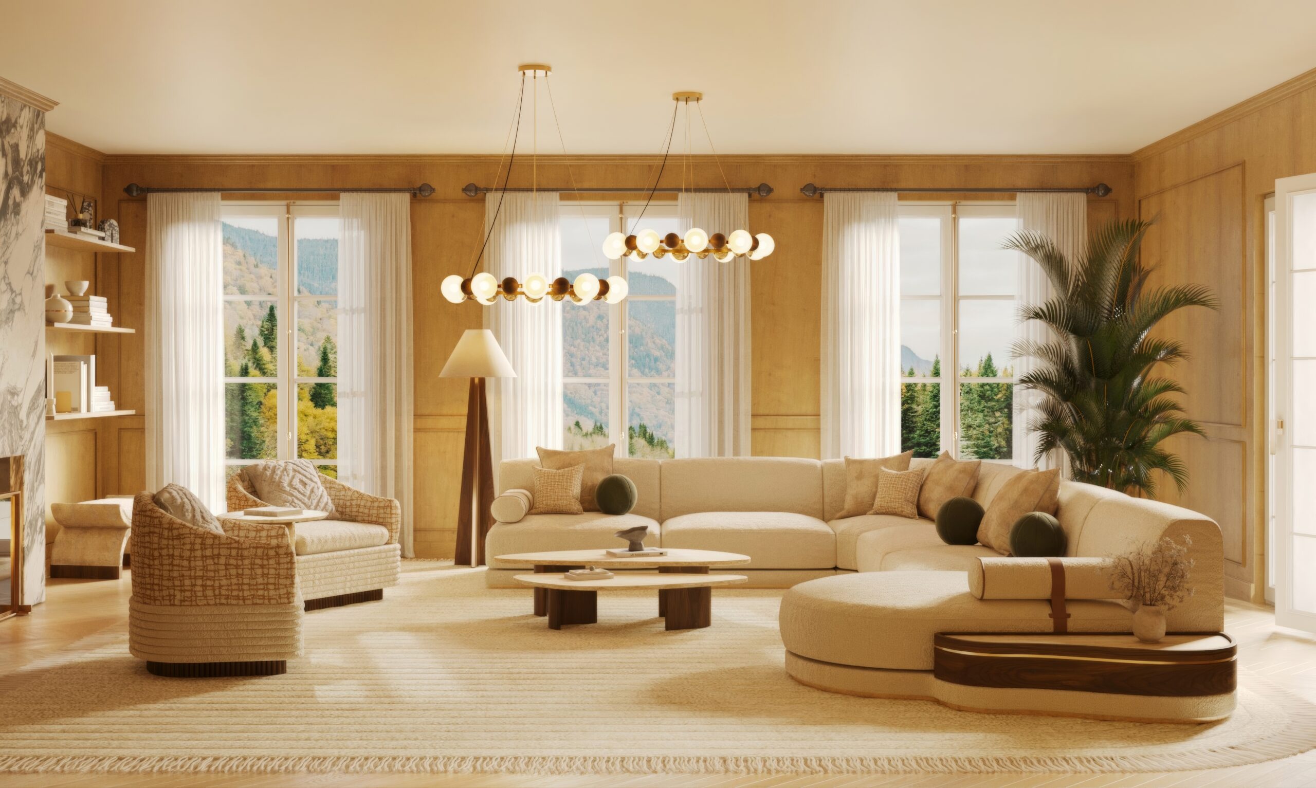
Creating a refined space with warm neutrals starts with intentional layering. Choose a base color such as creamy beige or soft caramel, then build on it with deeper or lighter tones to add visual depth. This can include textured fabrics like bouclé or velvet in off-white, travertine accents, and walnut or oak finishes.
One of the most important elements in working with neutrals is texture. A palette of cream and sand can feel flat without tactile variation, so incorporating a range of finishes—matte woods, plush upholstery, linen drapes, ceramic accessories—is essential to achieving warmth and sophistication.
Key Nolita Harbour Pieces That Embrace Warm Neutrals
At Nolita Harbour, we believe that neutral design doesn’t mean neutral impact. Our collection features pieces that celebrate warm tones through thoughtful craftsmanship and timeless design:
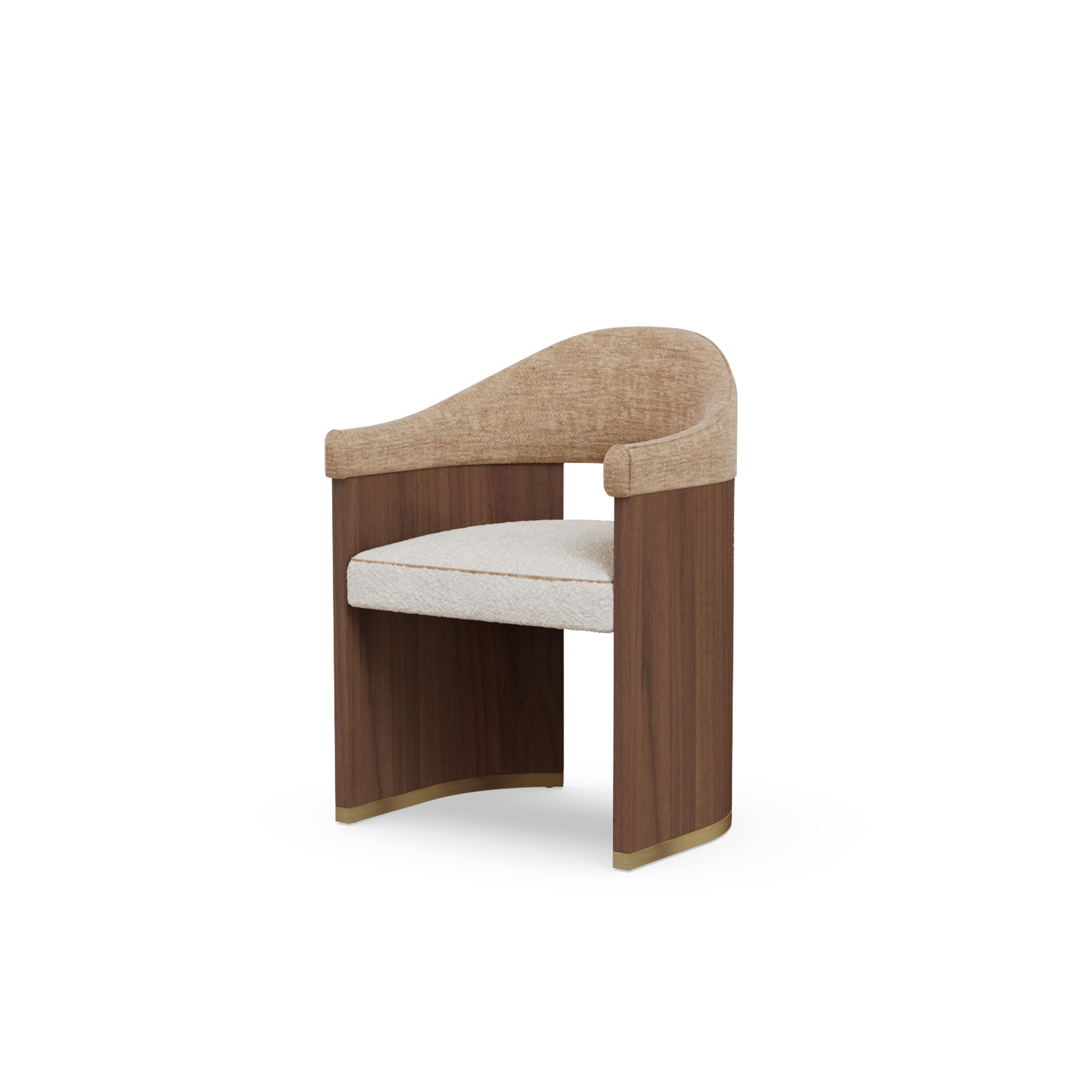
- Coralie Dining Table: With its smooth curves and luxurious walnut matte finish, the Clarette Dining Table becomes the grounding element in any neutral-toned dining area. Its sculptural profile reflects the elegance of understated design.
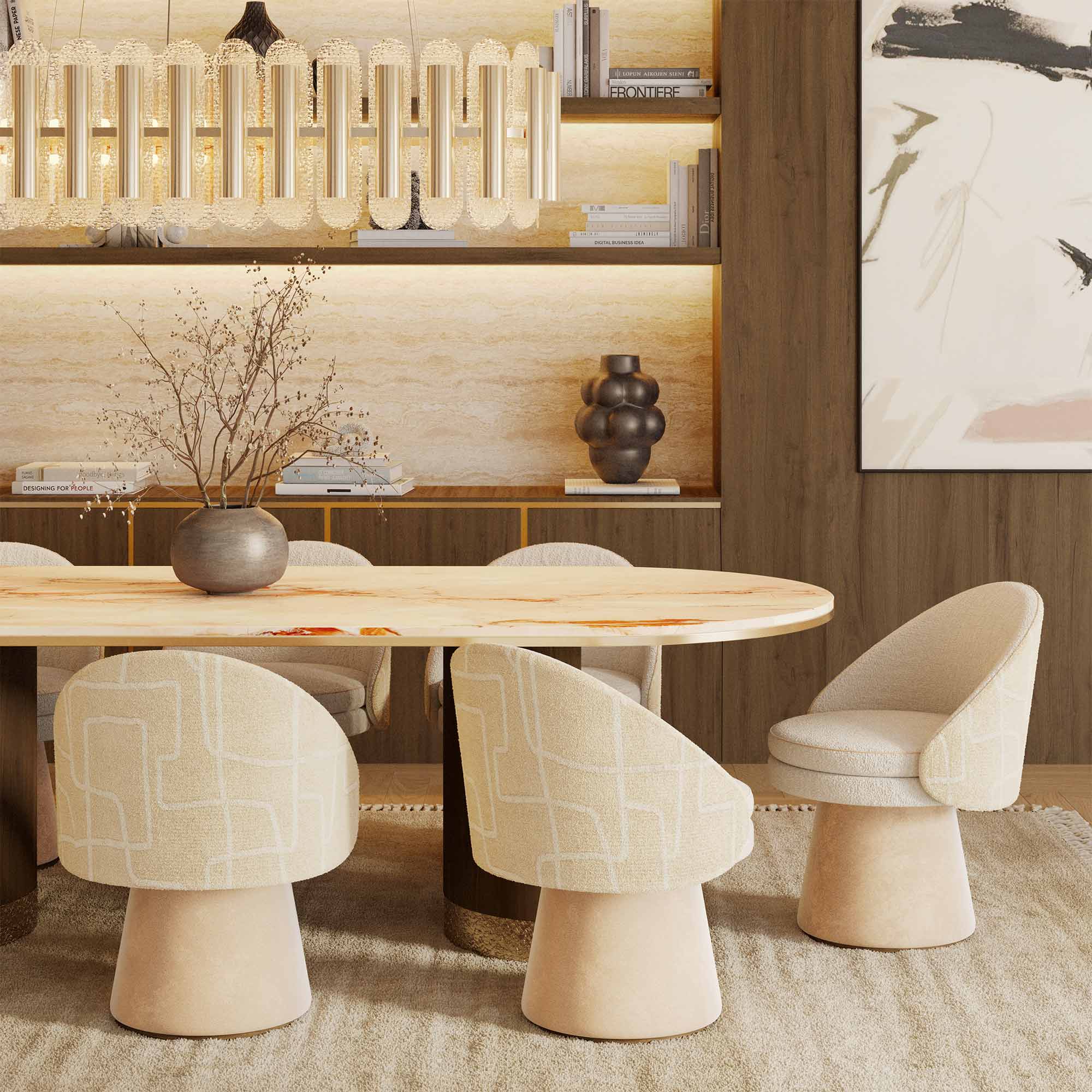
- Junna Dining Chair: Upholstered in soft bouclé and paired with oak matte legs, this chair is the perfect companion to neutral dining spaces. Its rounded silhouette and inviting texture add warmth and sophistication.
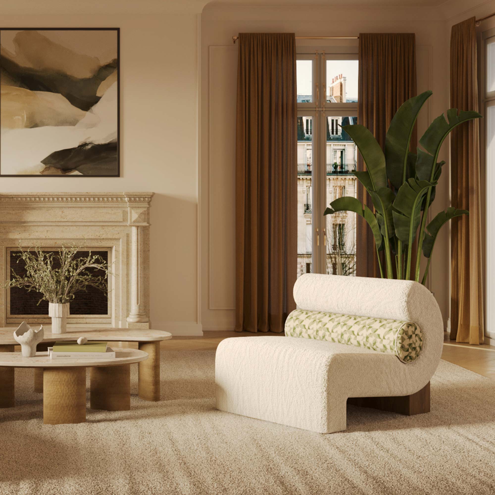
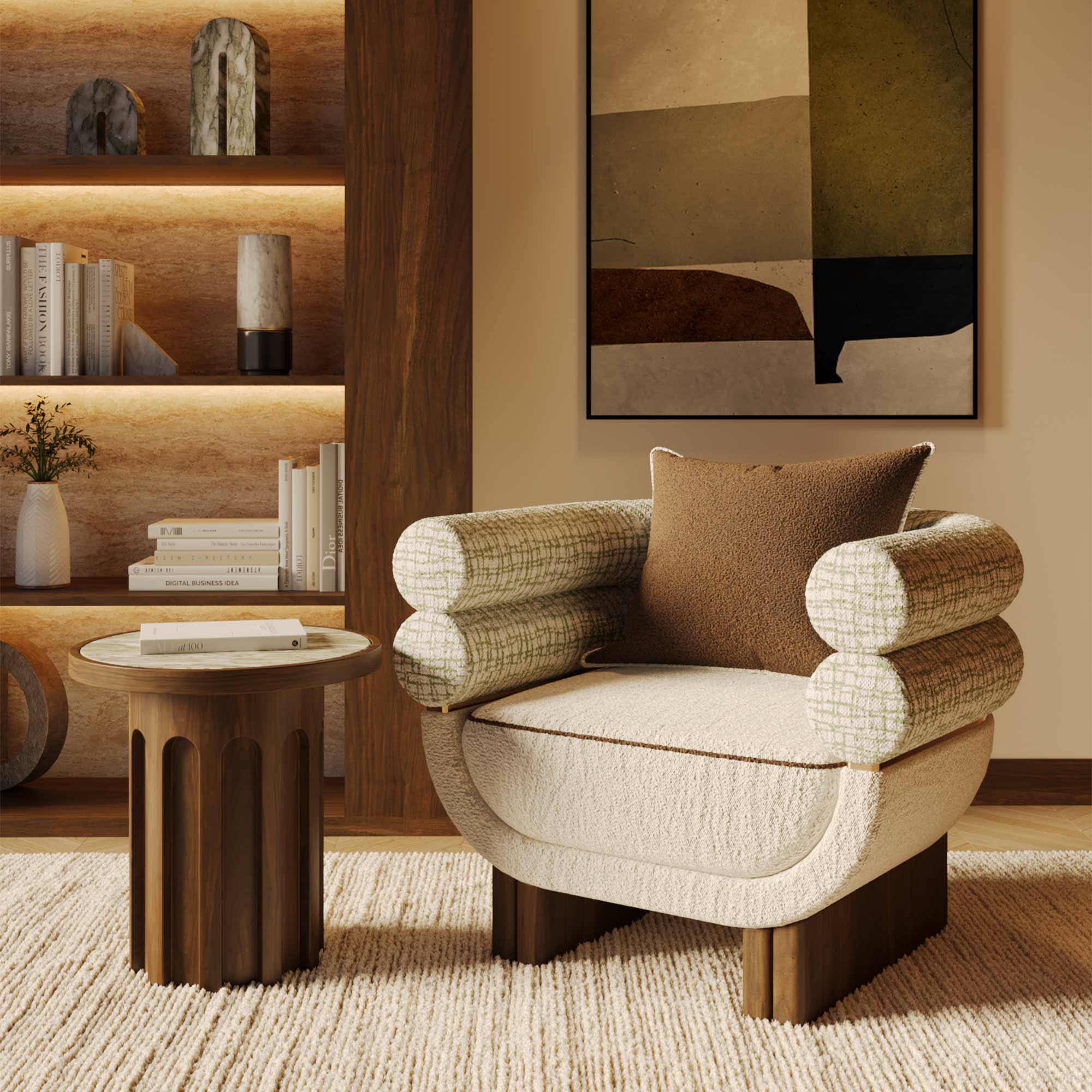
- Mia Armchair: Ideal for living rooms or reading nooks, the Mia Armchair in warm velvet or bouclé offers enveloping comfort with a gently rounded back that embraces you in softness. Available in creamy tones that suit any warm neutral palette.
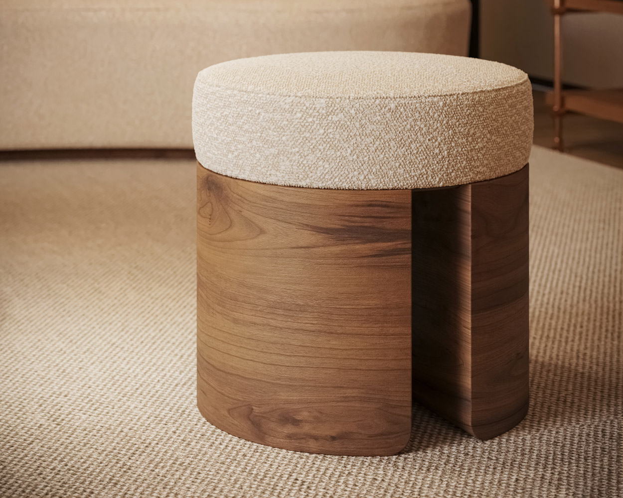
- Pauline Stool: A versatile piece that works in entryways, bedrooms, or beside a low console, the Pauline Stool features oak matte finishes and curved bouclé upholstery. It’s a gentle accent that echoes the softness of neutral interiors.
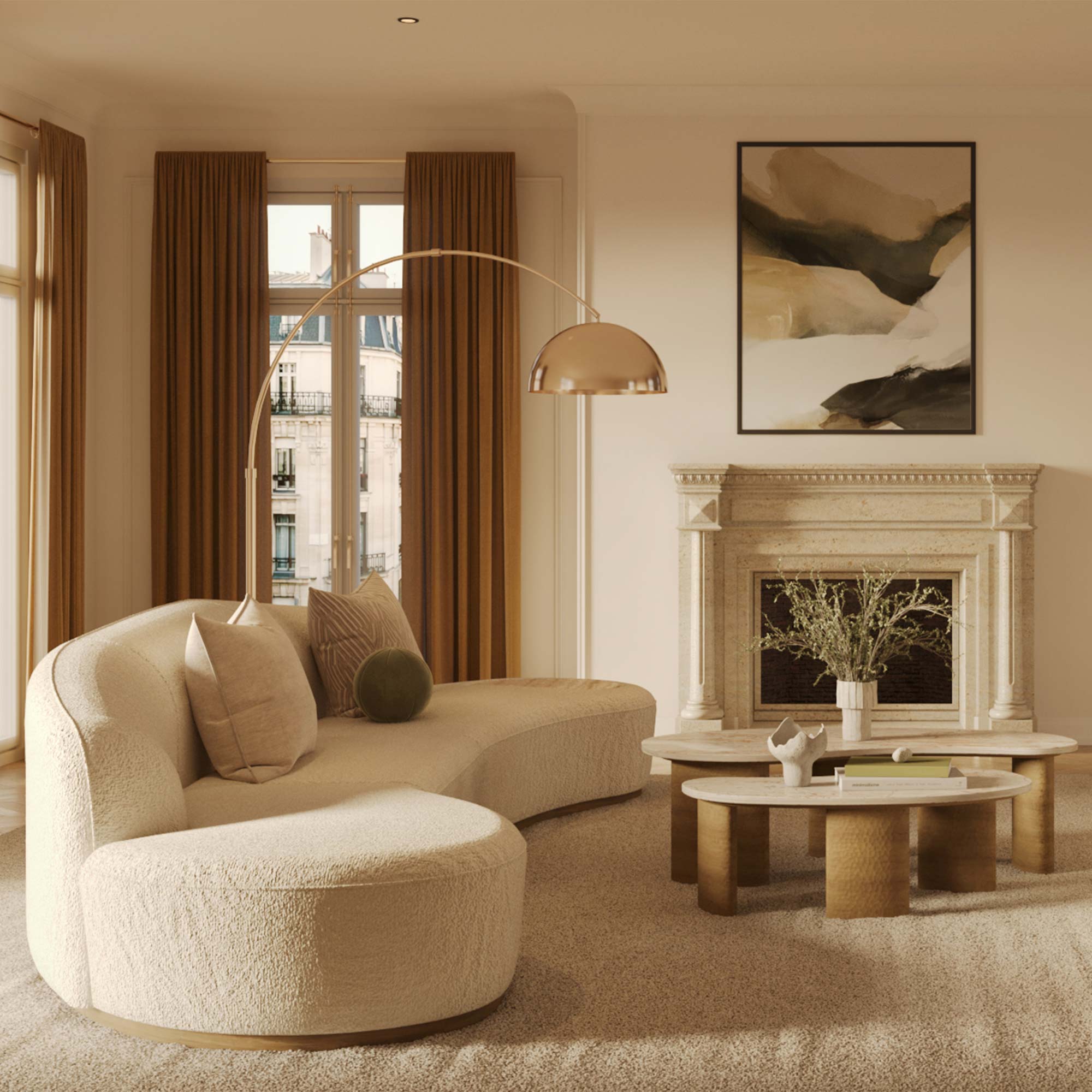
- Nathalie II Sectional Sofa: This expansive piece blends deep comfort with a luxurious aesthetic. Upholstered in soft neutral fabric and structured with architectural lines, it brings harmony and sophistication to living areas while embracing the serene palette of warm neutrals.
Balancing Neutrals with Color and Accents
Although warm neutrals can stand alone, they also play well with color when used strategically. Consider incorporating soft blush, muted terracotta, or sage green to create moments of visual interest. Metallic accents in brass or bronze also elevate neutral spaces, reflecting light and introducing a subtle shimmer.
Artwork, ceramics, and soft furnishings offer opportunities to introduce these accents while maintaining harmony. A wool rug in a sandy tone, linen curtains in taupe, or abstract art in muted palettes can all reinforce the color story without overwhelming the serenity of the space.
Final Thoughts
Using warm neutrals in interior design is a masterclass in balance. These hues provide the perfect backdrop for a range of aesthetics while adding depth, emotion, and texture. They require a designer’s eye for layering, proportion, and quality—but when done well, the results are effortlessly elevated.